As the mobile devices market exploded, the need for fluid (not fixed) web design became essential. Responsive Web design suggests that design and interface structure should respond to the user’s behaviour and environment.
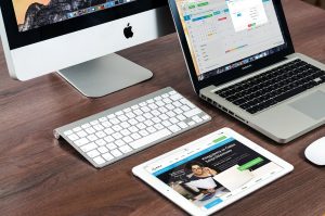
image source: https://www.maxpixel.net/Macbook-Apple-Imac-Computer-Screen-Laptop-606763
Responsive web design has become more important as the amount of mobile traffic now accounts for more than half of total internet traffic. Responsive web design is also an example of how user interface plasticity continues to develop along with new technologies.
In other words, a website should automatically respond to the user’s preferences, based on screen size, platform and orientation, getting rid of the need for a different design and development phase for each new gadget on the market.
The practice consists of a mix of flexible grids and layouts, images and intelligent use of CSS media queries. As the user switches from their laptop to iPad, the website should automatically switch to accommodate for resolution, image size and scripting abilities. One may also have to consider the settings on their devices.

image source: https://search.creativecommons.org/photos/f11d61a1-1ac8-406a-9630-a842762e36f0 by Vanderjoe
A site designed with RWD adapts the layout to the viewing environment by using fluid, proportion-based grids, flexible images and CSS3 media queries in the following ways:
- The fluid grid concept calls for page element sizing to be in relative units like percentages, rather than absolute units like pixels or points.
- Flexible images are also sized in relative units, so as to prevent them from displaying outside their containing element.
- Media queries allow the page to use different CSS style rules based on characteristics of the device the site is being displayed on (e.g. width of the rendering surface, browser window width or physical display size).
- Responsive layouts automatically adjust and adapt to any device screen size, whether it is a desktop, a laptop, a tablet, or a mobile phone.
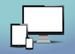
image source: https://www.maxpixel.net/Pc-Phone-Screen-Tablet-Monitor-On-White-Display-314153
info source:
